Table of contents
There has been an increasing popularity of Dark Mode in the past few years, and you may have noticed it yourself. In this tutorial, I'll provide a step-by-step guide to adding a Dark Mode toggle to your website using Next.js and ChakraUI. This toggle can be easily implemented on any of your websites in order to create an enhanced user experience for your visitors.

An overview
Let's begin by getting an overview of the tech stack that we will use to carry on with this project.
What is React?
React is a free and open-source front-end JavaScript library developed by Facebook. It's used for building interactive user interfaces and web applications based on components quickly and efficiently. To find out more, check out the React documentation.
What is Next.js?
Next.js is a React framework that gives us the building blocks to create web applications.
By framework, it means Next.js handles the tooling and configuration needed for React and provides additional structure, features, and optimizations for your application. To find out more, check out Next.js documentation.
What is Chakra UI?
Chakra UI is a simple, modular, and accessible component library. It's made up of basic building blocks that can help you build the User Interface (UI) of the front end of your web application.
Chakra UI comes with built-in support for managing color modes in your apps easily. Chakra's components are dark mode compatible by default. In some scenarios, you might need to make your components respond to color mode.
To learn more, check out the Chakra UI documentation.
Let's Build Our Project.
Now, let's look at the prerequisites needed to develop our project.
Requirements
Node.js 16.8.0 or newer
MacOS, Windows (including WSL), and Linux are supported.
Create a Next.js app
Let's use create-next-app to build a new Next.js app, which will automatically set up all of our app's dependencies and modules.
Head over to your terminal and type the following.
npx create-next-app dark-light-mode-toggle

cd dark-light-mode-toggle

npm run dev
dark-light-mode-toggle is the name of the project, you can keep any at your convenience.
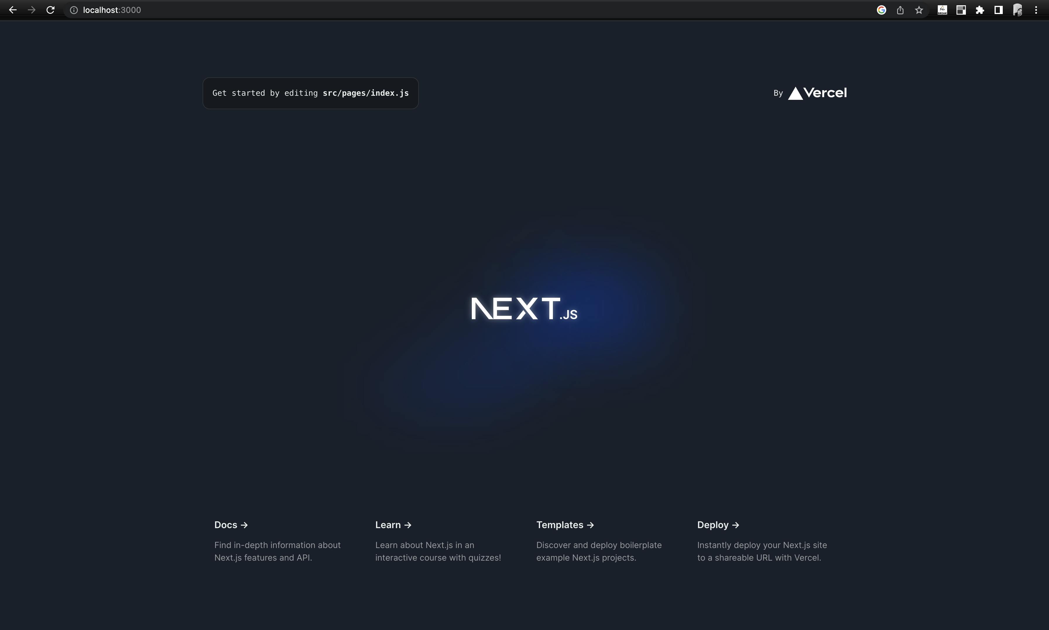
This command will create a new Next.js app and now head over to the development server on port 3000 to see your app live in action.

You would be able to see this page on your local host port.
Install Chakra
Let's now install Chakra in our app dark-light-mode-toggle. Head over to the terminal and add this command.
npm i @chakra-ui/react @emotion/react @emotion/styled framer-motion
After installing Chakra UI, you need to set up the ChakraProvider at the root of your application. This can be either in your index.js, pages/_app.js or App.js depending on the framework you use.
Setting up Chakra UI with Next.js
So, for our next.js app, we have _app.js in the pages folder where we would include our ChakraProvider.
Head over to pages/_app.js (create it if it doesn't exist) and wrap the Component with the ChakraProvider:
import '../styles/globals.css'
import { ChakraProvider } from "@chakra-ui/react"

function MyApp({ Component, pageProps }) {
  return (
    <ChakraProvider>
      <Component {...pageProps} />
    </ChakraProvider>
  )
}

export default MyApp
Now, go to your localhost:3000 port and you will see a slight difference in the background color of the homepage.

What happens here is, when you set up Chakra Provider, Chakra UI sets the color of your app according to your system preferences i.e. If your browser has dark mode enabled, it will set the dark color palette for your app and vice versa.
However, we can customize the theme of our app, we will see this in the next section of this article.
Updating the Chakra UI theme config
Chakra UI provides an extendTheme function that deep merges the default theme with your customizations.
Let's create a theme.js file in the root of our project or if we want we could directly include our theme configuration in _app.js.
/// theme.js

// 1. import `extendTheme` function
import { extendTheme } from "@chakra-ui/react";

// 2. Add your color mode config
const config = {
  initialColorMode: "light",
  useSystemColorMode: false,
};

// 3. extend the theme
const theme = extendTheme({ config });

export default theme;
Here we have created our config which sets up the initial color mode of our app to light. The theme config for color mode has 2 options:
initialColorMode: The initial mode you'd like your app to start with when a user visits the page for the first time. The value can be one ofdark,lightorsystem. The default value islight.useSystemColorMode: Iftrue, Chakra UI subscribes to changes insystemcolor mode. If set tofalse, the app's color mode is detached from thesystemcolor mode.
Now pass this theme config as a prop to the ChakraProvider that we initially set up in our _app.js.
import '../styles/globals.css'
import { ChakraProvider } from "@chakra-ui/react"
import theme from '../theme'

function MyApp({ Component, pageProps }: AppProps) {
  return (
    <ChakraProvider theme={theme}>
      <Component {...pageProps} />
    </ChakraProvider>
  )
}

export default MyApp
Let's create a toggle button component

Create a new folder component and a file ToggleButton.js in it. To create a toggle-switching button using the icon, you can import icons from any icons library. Let's use react-icons to import toggle button icons (BsSun for light mode and BsMoon for dark mode).
Install react-icons in your project using npm i react-icons.
The code for the toggle component would look like these.
//Toggle.js

import {
  VStack,
  IconButton,
  useColorMode,
  useColorModeValue,
  Heading,
} from "@chakra-ui/react";
import { BsSun, BsMoon } from "react-icons/bs";

function Toggle() {
  // Chakra UI hook that toggle the color mode
  const { toggleColorMode } = useColorMode();
  return (
    <VStack>
      {useColorModeValue(
        <Heading>Light Mode</Heading>,
        <Heading>Dark Mode</Heading>
      )}
      <IconButton
        aria-label="Mode Change"
        variant="outline"
        colorScheme="black"
        size="lg"
        icon={useColorModeValue(<BsMoon />, <BsSun />)}
        onClick={toggleColorMode}
      />
    </VStack>
  );
}

export default Toggle;
Now import this Toggle component wherever you want to display your toggle button in your app. I have imported this into the index.js file for now.
How mode toggle work?
Chakra UI uses useColorMode that is a React hook that gives you access to the current color mode, and a function to toggle the color mode as we have done here when we click on our button, it toggles the color mode and the icon for the respective modes.


You can customize your toggle button according to your style.
Customize any Component/Element styling using useColorModeValue
Chakra UI provides a react hook useColorModeValue to change any value or style based on the color mode.
It takes 2 arguments: the value in light mode, and the value in dark mode.
For example - if you want to change the background color of a Box from grey in dark mode to white in light mode, the following is the code.
<Box bgColor={useColorModeValue("white", "grey")}></Box>
So, that sums up how you can add a dark mode toggle to your Next.js application using Chakra UI.
For detailed documentation about how color mode works in Chakra UI, please go through the official Chakra UI docs here.
View the source code here - https://github.com/janvi01/dark-light-mode-toggle
Thanks for reading! I hope you find this blog post useful. Please let me know your feedback in the comments. You can connect with me on Twitter or LinkedIn. 🚀❤️

